Adobatech brand guidelines
The wordmark sets adoba in a heavy weight and tech in a light one. Heavy stands for built right and light for built fast.
Wordmark
Use the wordmark in one color: ink on light backgrounds, white on dark ones. The weight contrast is the identity, so it needs no second color.

Arabic and bilingual
In أدوباتك the weight changes after the alef, which never joins the next letter, so the change sits where the letters already separate.
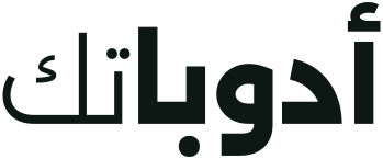



Use the bilingual lockup where both audiences see the same surface, such as signage, event badges and documents in two languages.
Icon
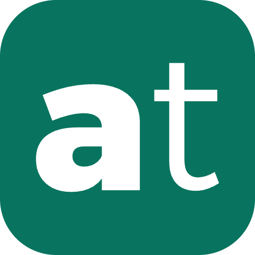
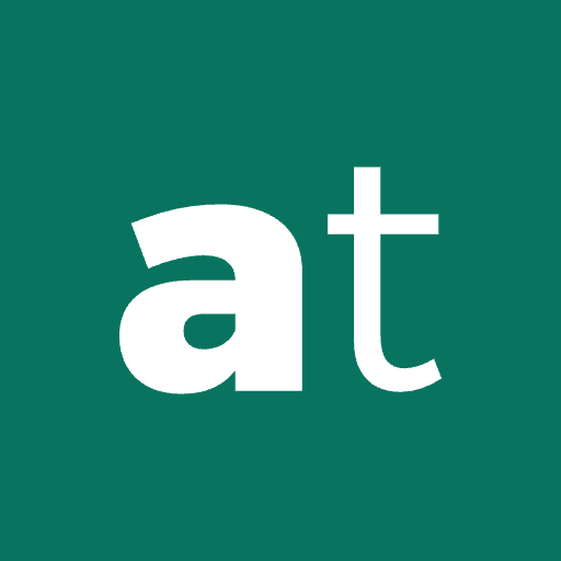
Two square marks in white on the accent color. The heavy "a" is the favicon. The "at" pairing, heavy "a" and light "t", is for app icons and social profile pictures.
 32px
16px
32px
16px
 32px
16px
32px
16px
Clear space and minimum size
Keep other text, images and edges at least the height of the letter "a" away from the wordmark on every side.

Minimum size
16px tall on screen and 6mm tall in print. Below that, use the icon instead.
What to avoid
The wordmark only works when the weights and shapes stay exactly as drawn. Always start from the files on this page.
- Don't color adoba and tech differently. The whole wordmark is one color.
- Don't swap the weights. Adoba is always heavy and tech is always light.
- Don't re-type the logo in a font, even in Alexandria. Use the SVG files.
- Don't stretch, rotate, outline or add effects such as shadows and gradients.
- Don't letter-space the Arabic wordmark. Arabic letters join, and spacing breaks them apart.
Color
The Nile palette: a soft neutral canvas, near-black ink and one green accent. The accent is used sparingly, for buttons and one highlight per view.
-
- Canvas
#F4F5F2- Page background
-
- Paper
#E9ECE7- Alternate sections
-
- Ink
#0D1714- Text, logo and dark sections
-
- Muted
#4E5C57- Secondary text
-
- Accent
#08745F- Buttons, icon background, one highlight per view
-
- Accent on dark
#5FD3B4- Accent on ink backgrounds
Every text pairing meets WCAG AA contrast: accent on canvas is 5.2:1 and muted on canvas is 6.4:1.
Typography
Alexandria, designed by the Egyptian type designer Mohamed Gaber, covers both Latin and Arabic. It is free under the SIL Open Font License and available from Google Fonts.
The weight rule
Heavy (900) stands for built right and light (250) for fast, with 520 as the base. The contrast appears only in the wordmark and the main headline, where "fast" is set light and "last" heavy. Everywhere else, headings are 600 and body text is 300. Latin headlines are tracked slightly tight; Arabic is never letter-spaced.
Press inquiries
For interviews, other file formats or questions about using the brand, email us. We reply within two working days.
[email protected]
Social media
Banners for LinkedIn and X at each platform's size. The content sits on the right, because both platforms place the profile picture over the bottom left. Use the app icon as the profile picture.